ROLE:
LEAD UX DESIGNER
TIMELINE:
6 WEEKS
PLATFORM:
ANDROID
YEAR:
2023

Zupee Home Revamp
Project Overview
Zupee is one of India’s leading real-money gaming platforms, offering casual, skill-based games like Ludo and Snakes & Ladders to a massive user base of over 100 million. The core users range from Gen Z to mid-career professionals, primarily in Tier 1–3 cities, with varying levels of digital fluency and trust in online gaming. As the lead product designer, I was responsible for reimagining the homepage experience—identifying key friction points, working with user research, conceptualizing the new design, and delivering final UI specifications ready for development.
The Problem
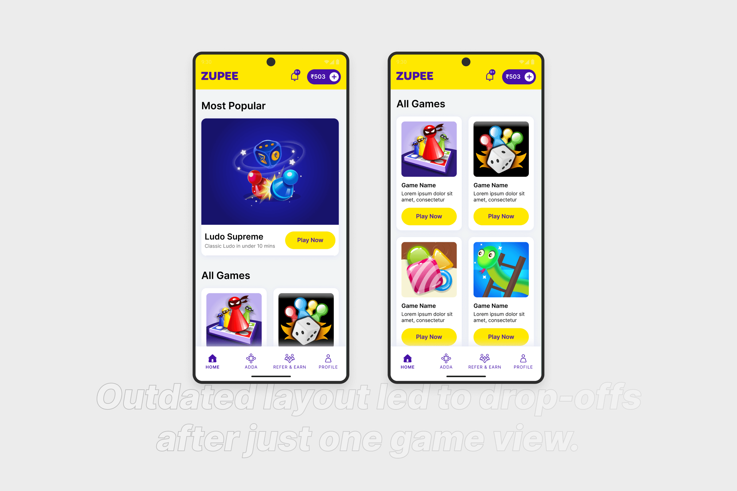
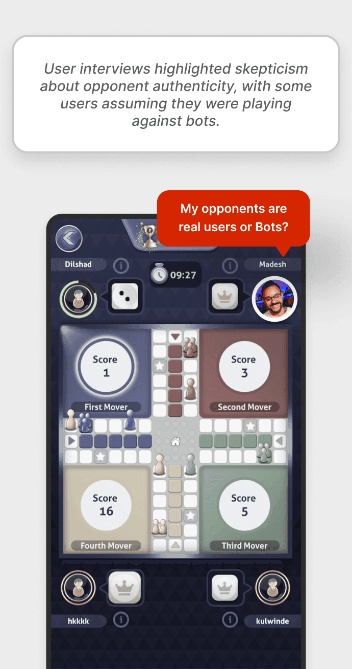
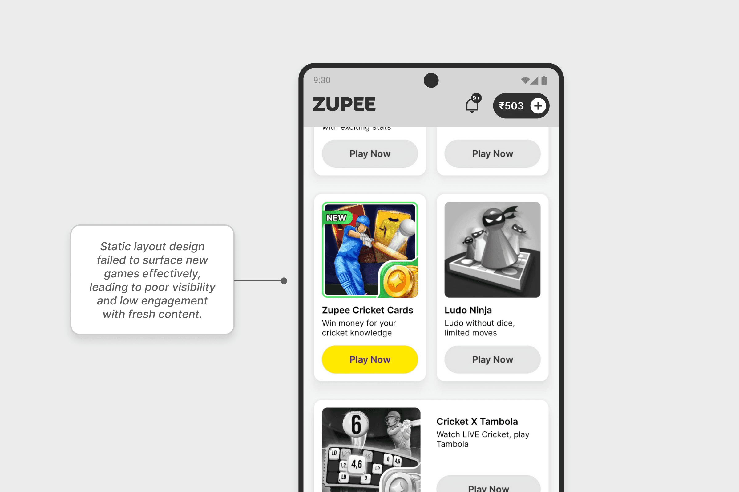
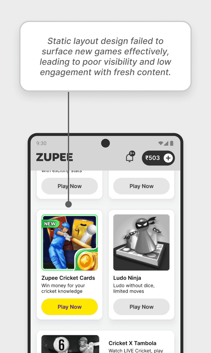
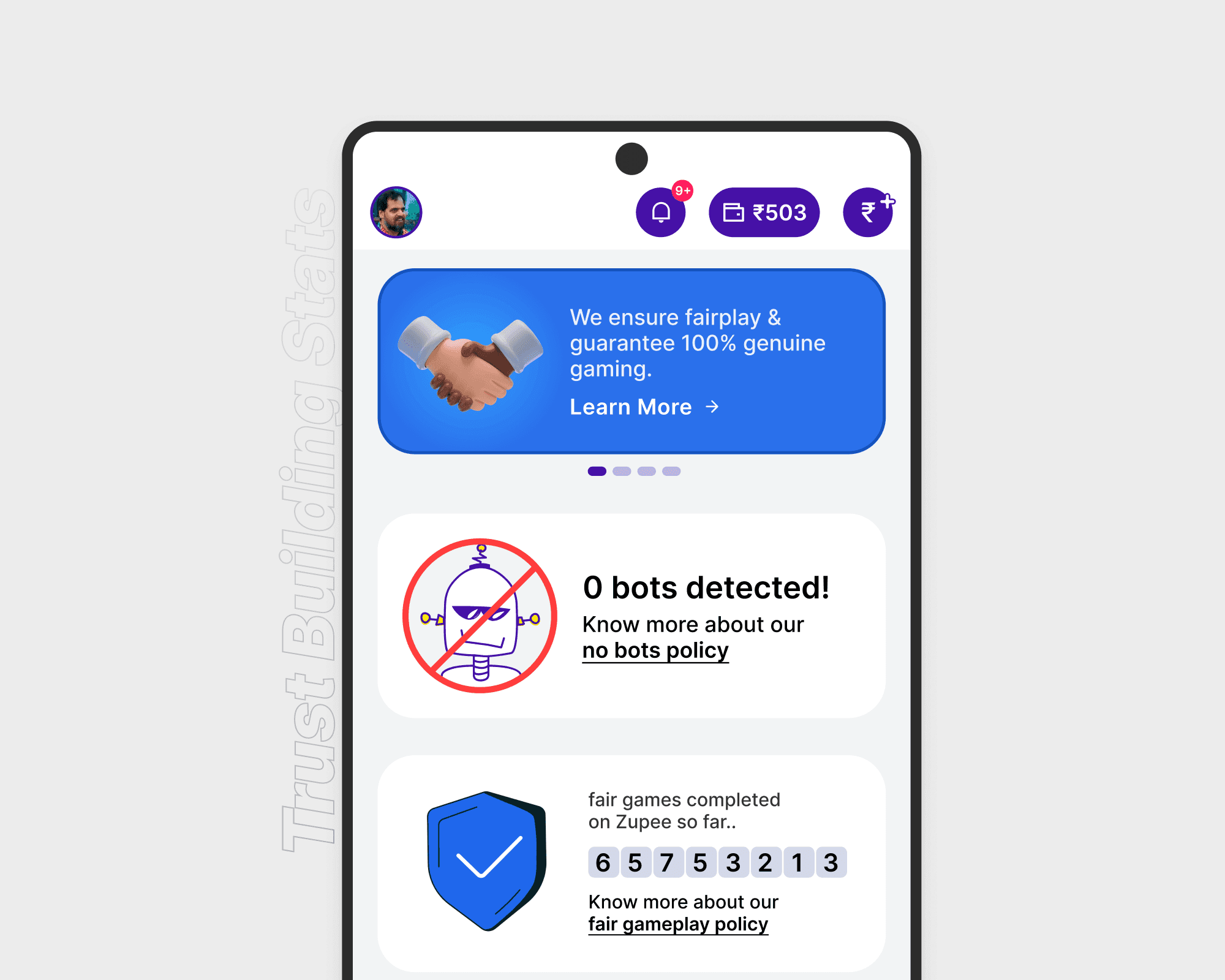
Despite strong user acquisition, the homepage was underperforming in engagement. Data showed that most users explored just one game before exiting, newly launched games received poor visibility, and many first-time users questioned the authenticity of their opponents—believing they might be bots.
The existing layout lacked trust-building elements, personalization, and a compelling visual hierarchy. Our goal was to drive deeper game discovery, increase credibility, and create a layout flexible enough to support frequent content updates and future scalability.
Research & Insights
We conducted funnel analytics, user interviews across Tier 2 and Tier 3 cities, and a competitive audit of platforms like MPL and WinZO. Three key insights emerged:
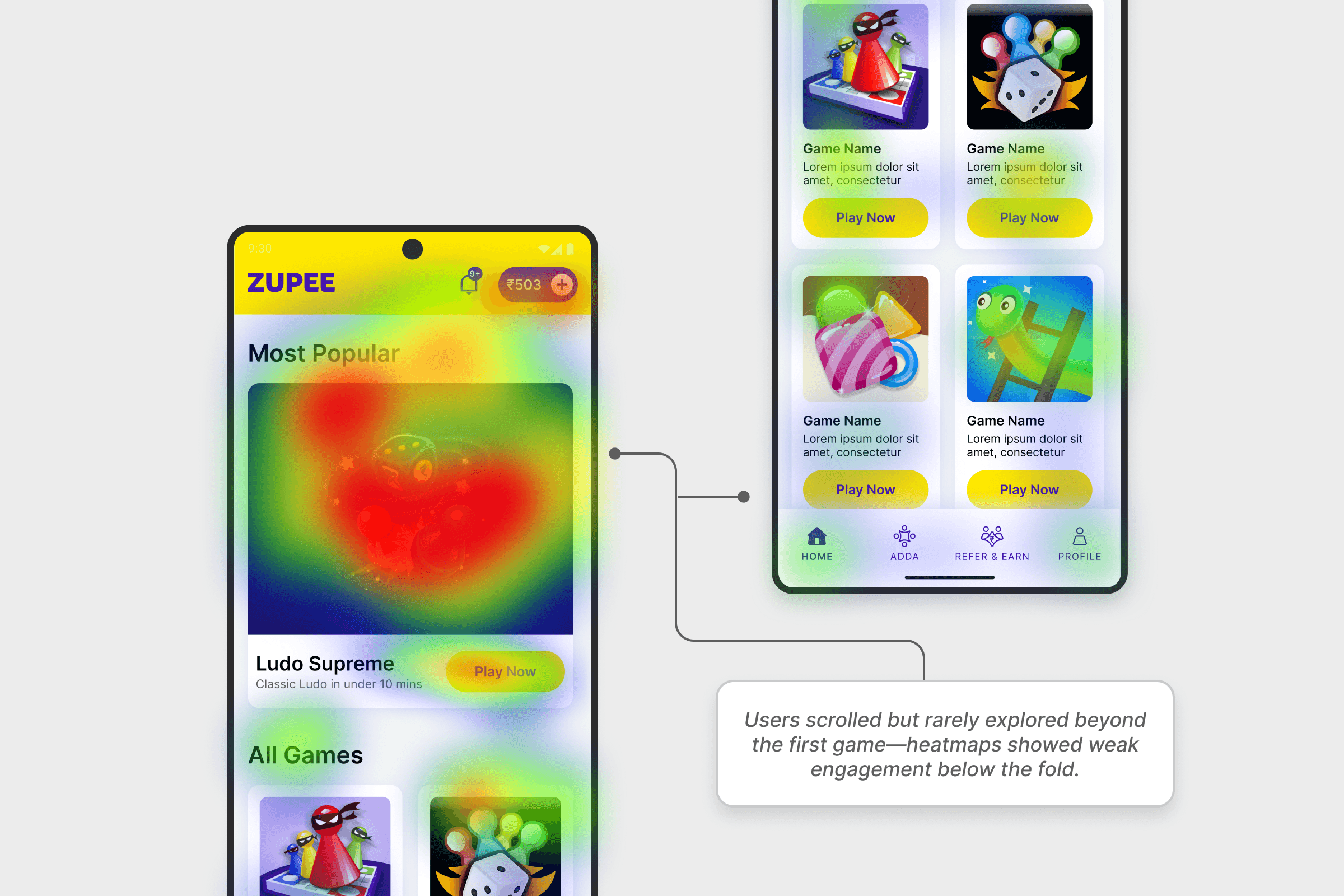
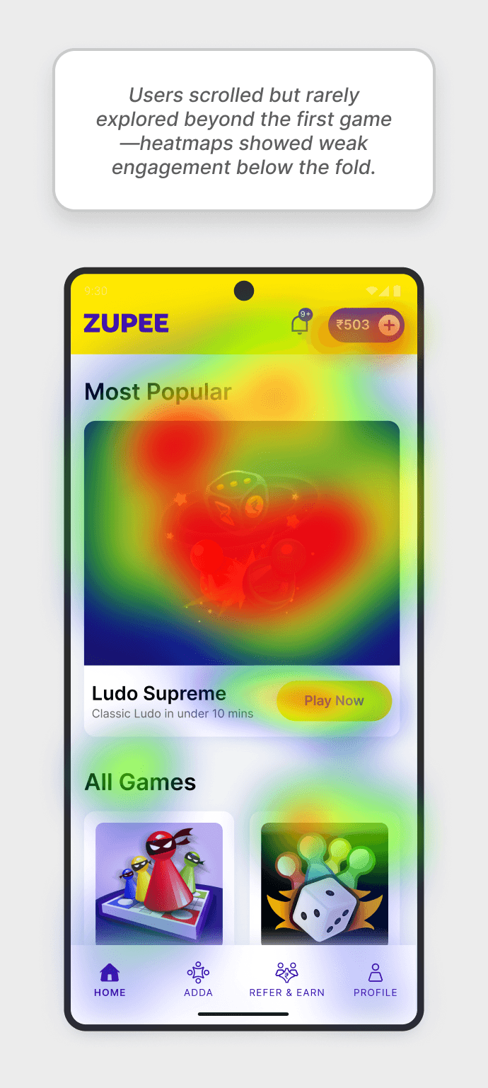
🔻 1. Around 40% of users dropped off after viewing only one game, largely due to a lack of visual cues for further exploration.
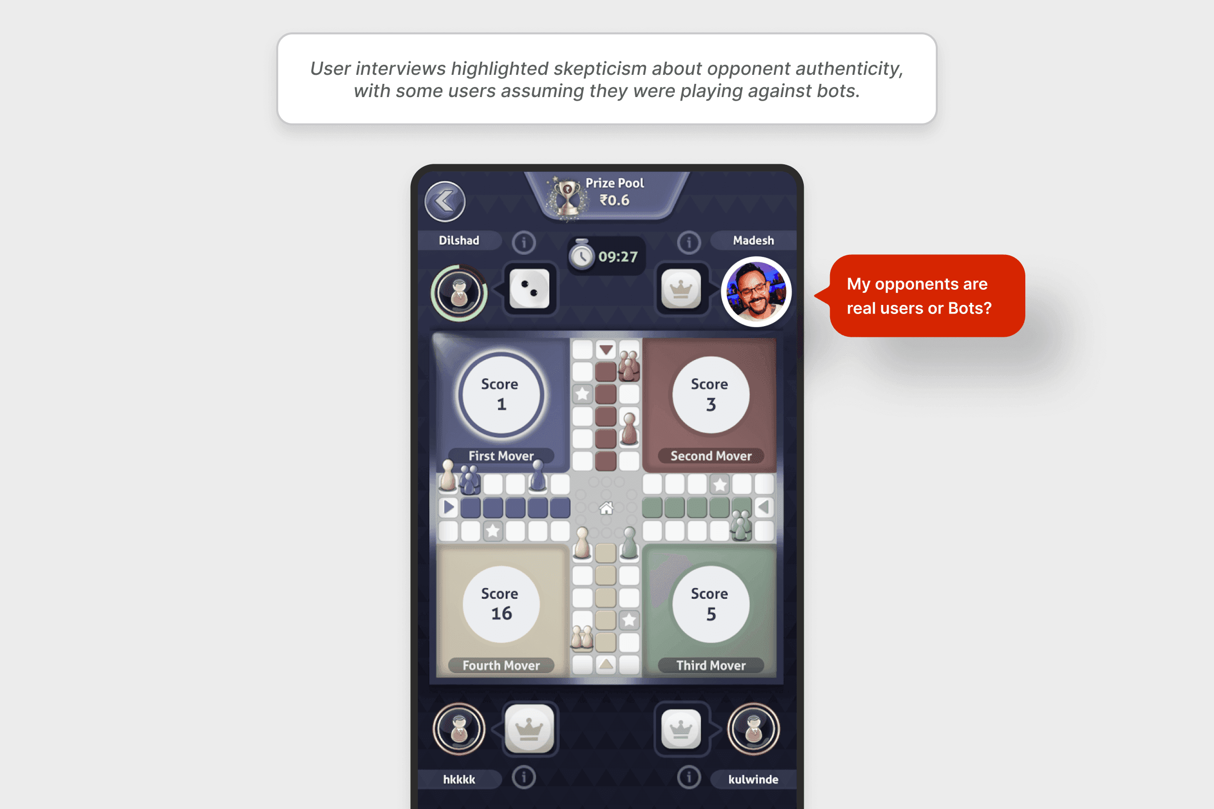
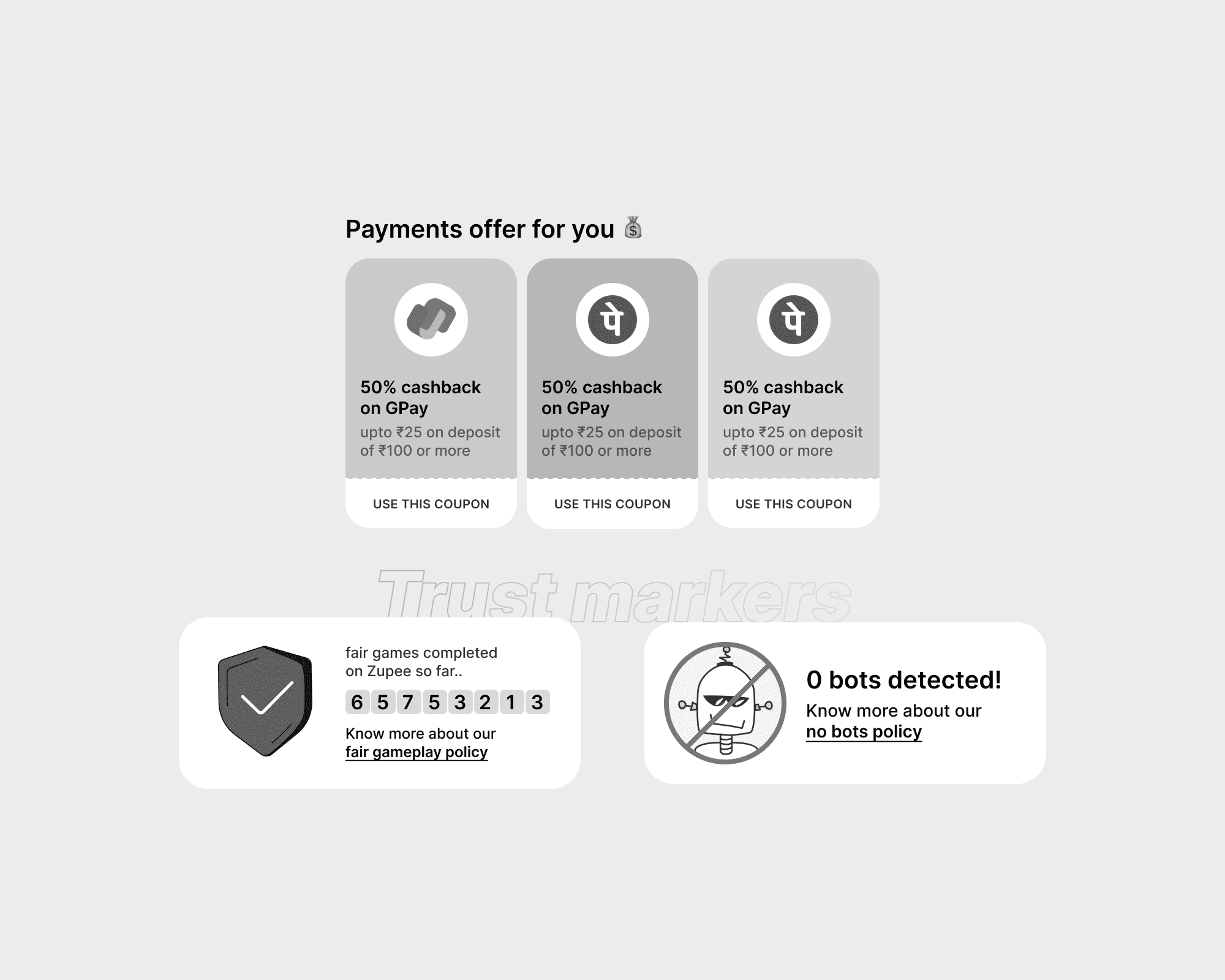
⚠️ 2. Users expressed concerns about whether their opponents were real, which directly impacted match participation.
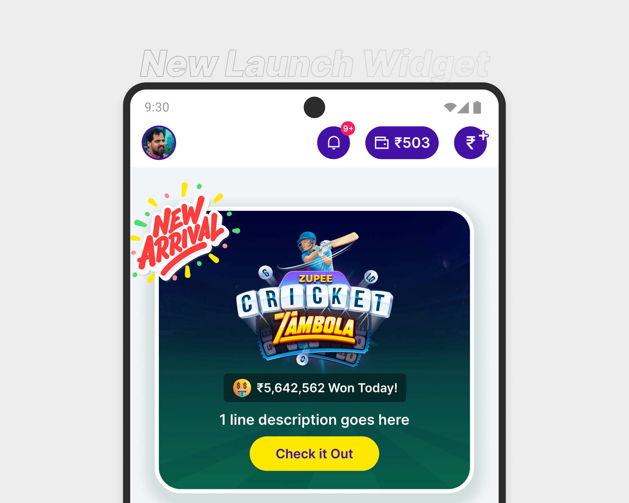
😔 3. The static layout buried new launches, making them easy to miss and limiting user engagement with fresh content.
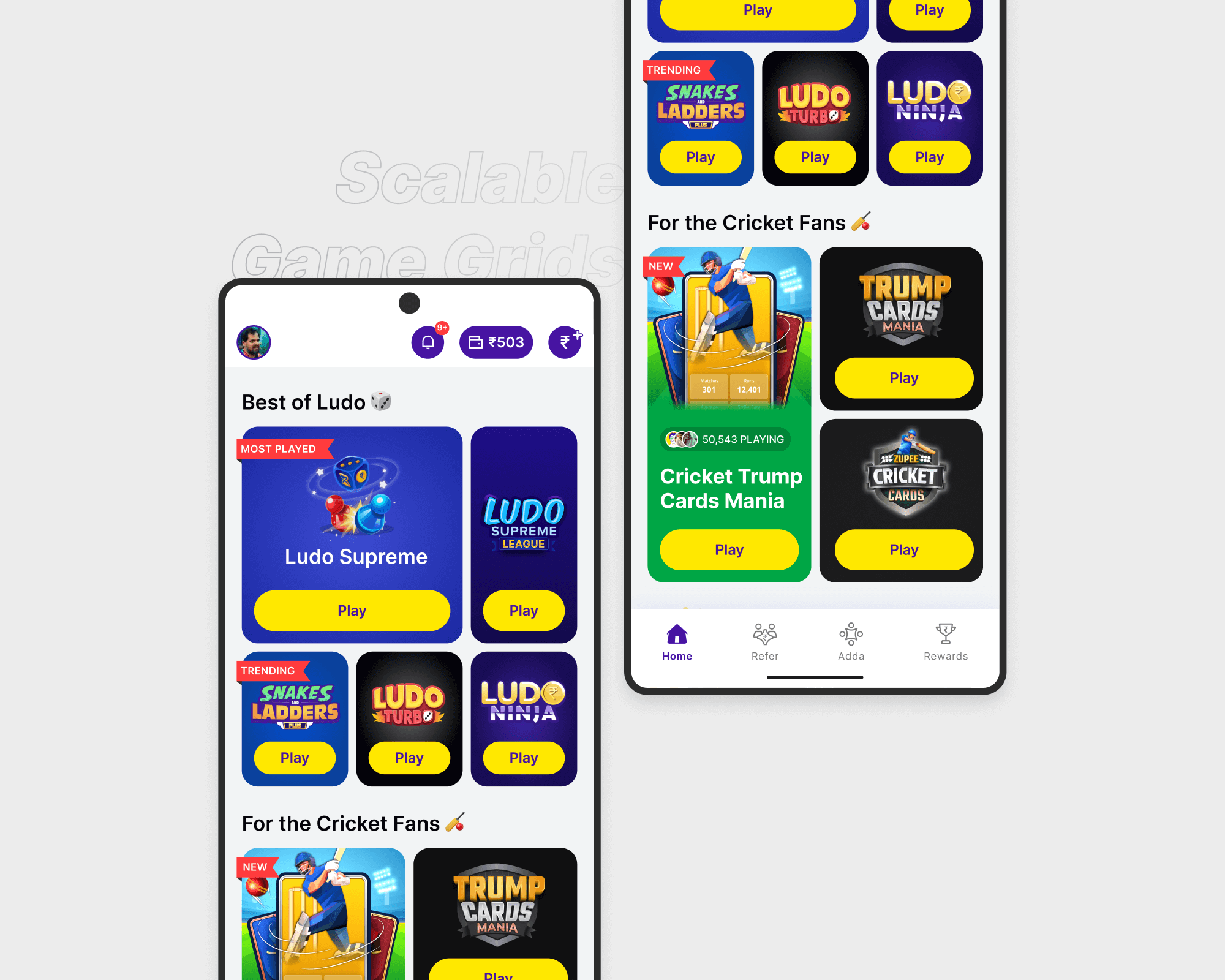
Design Process
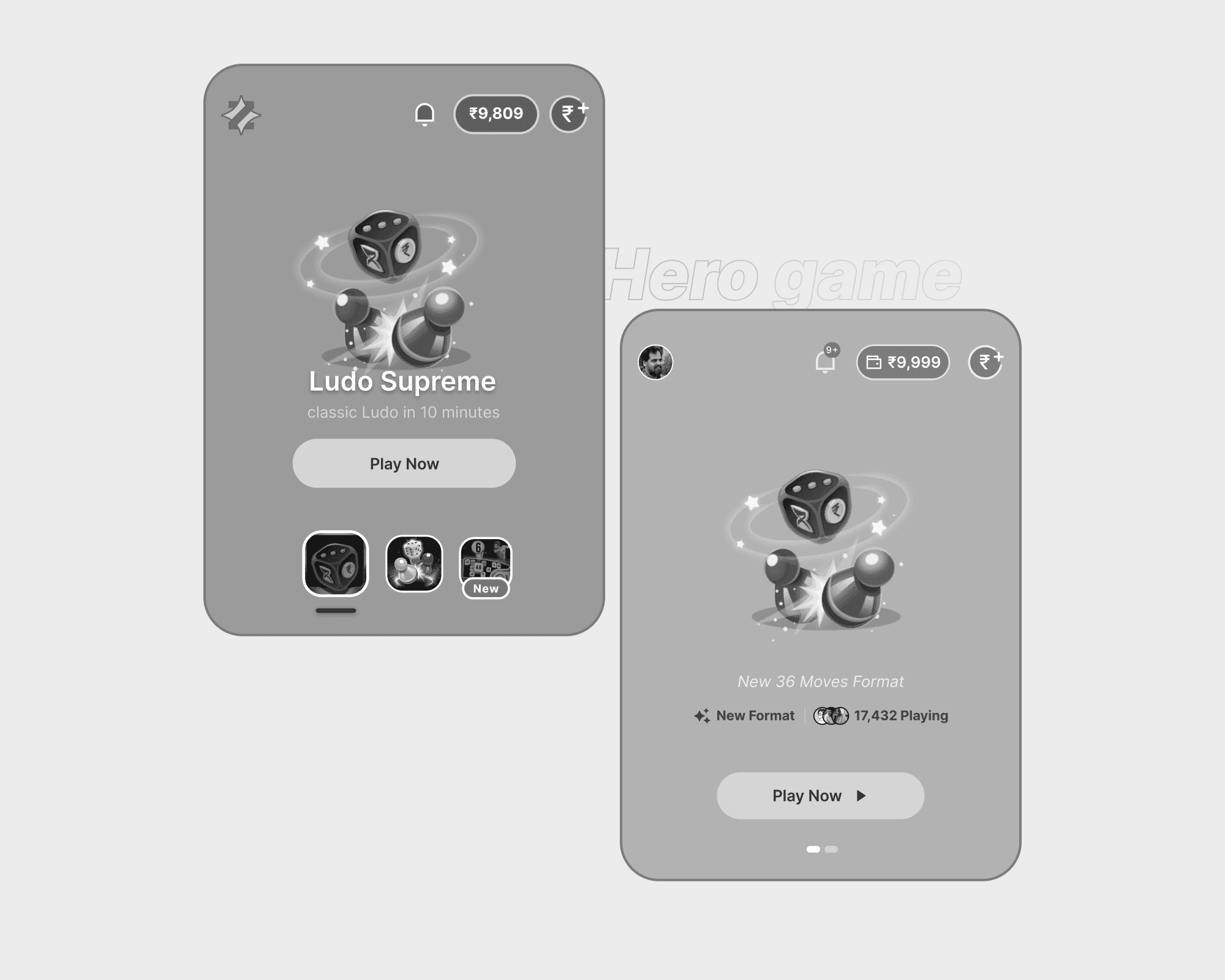
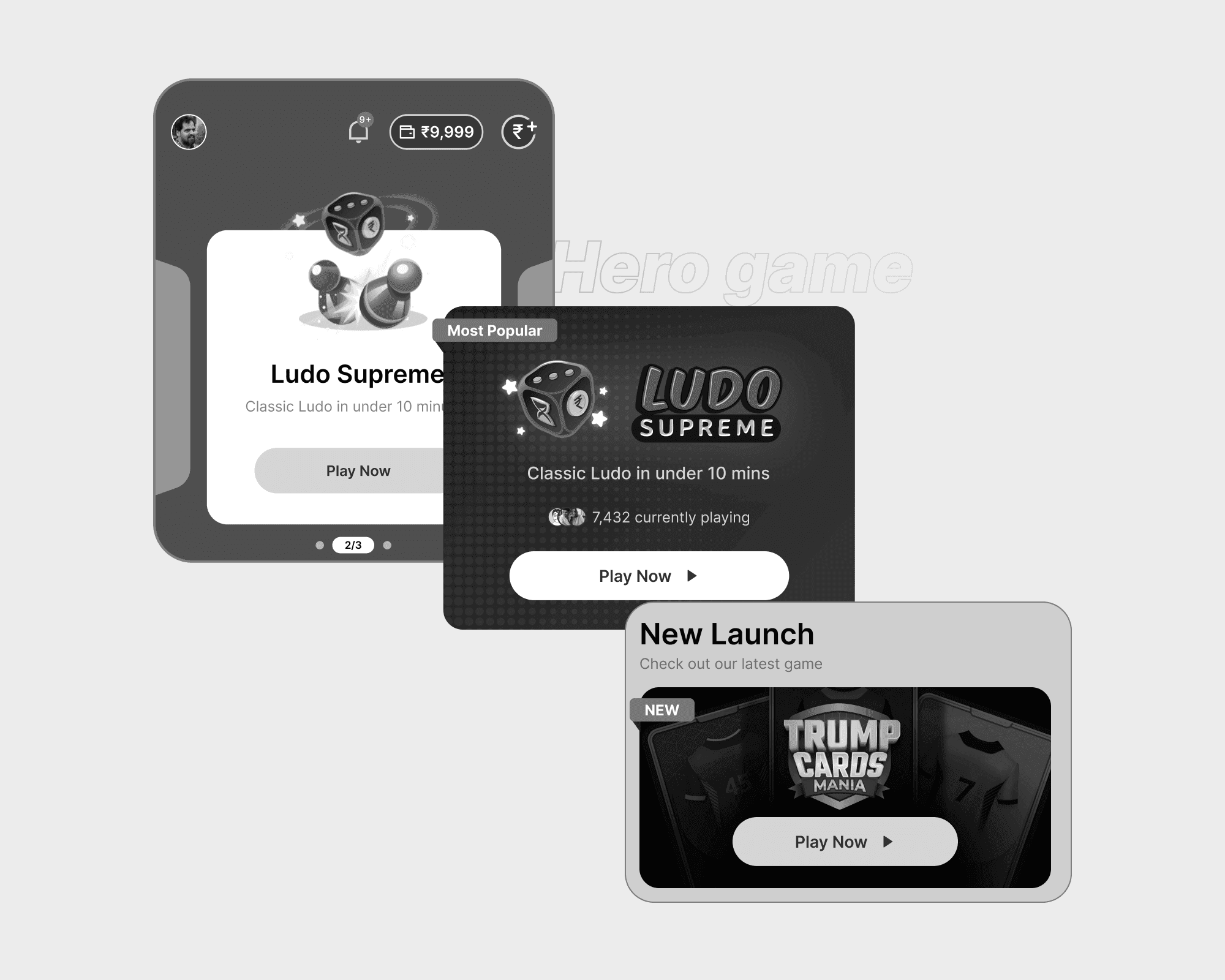
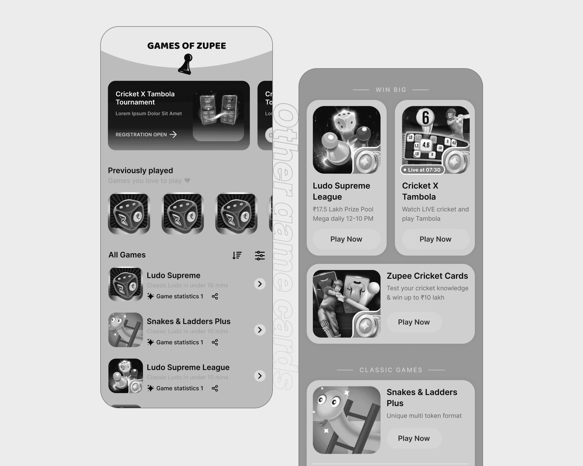
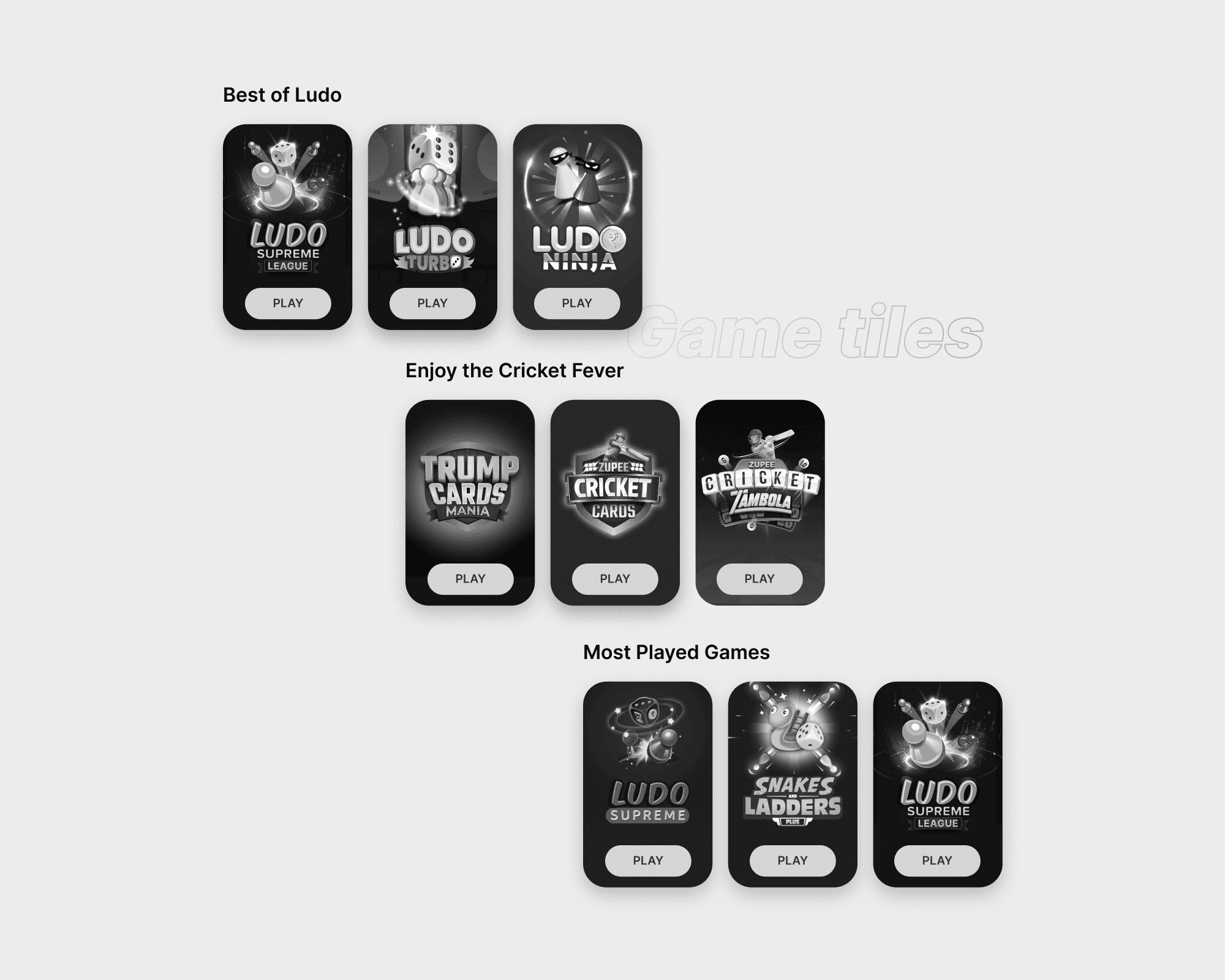
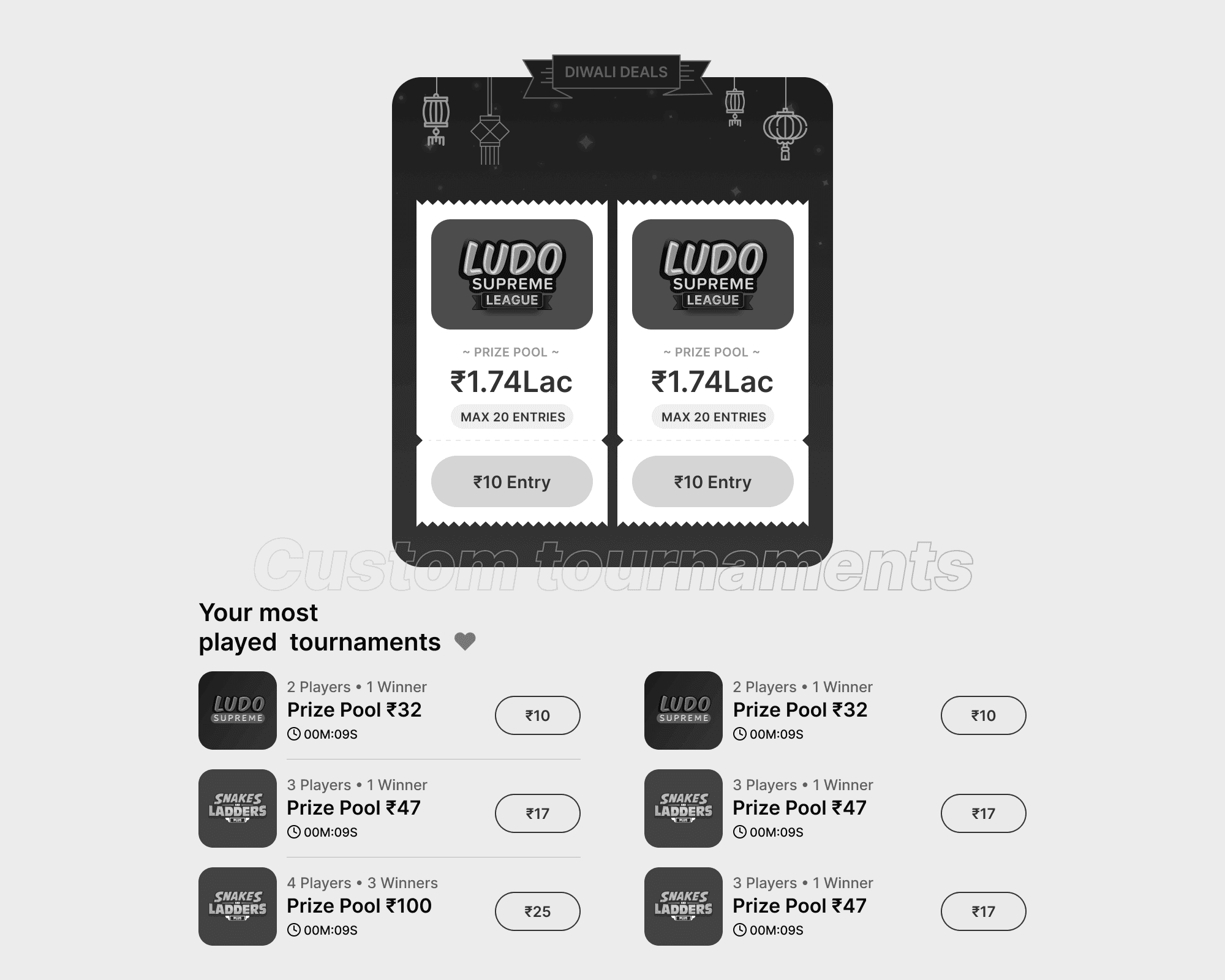
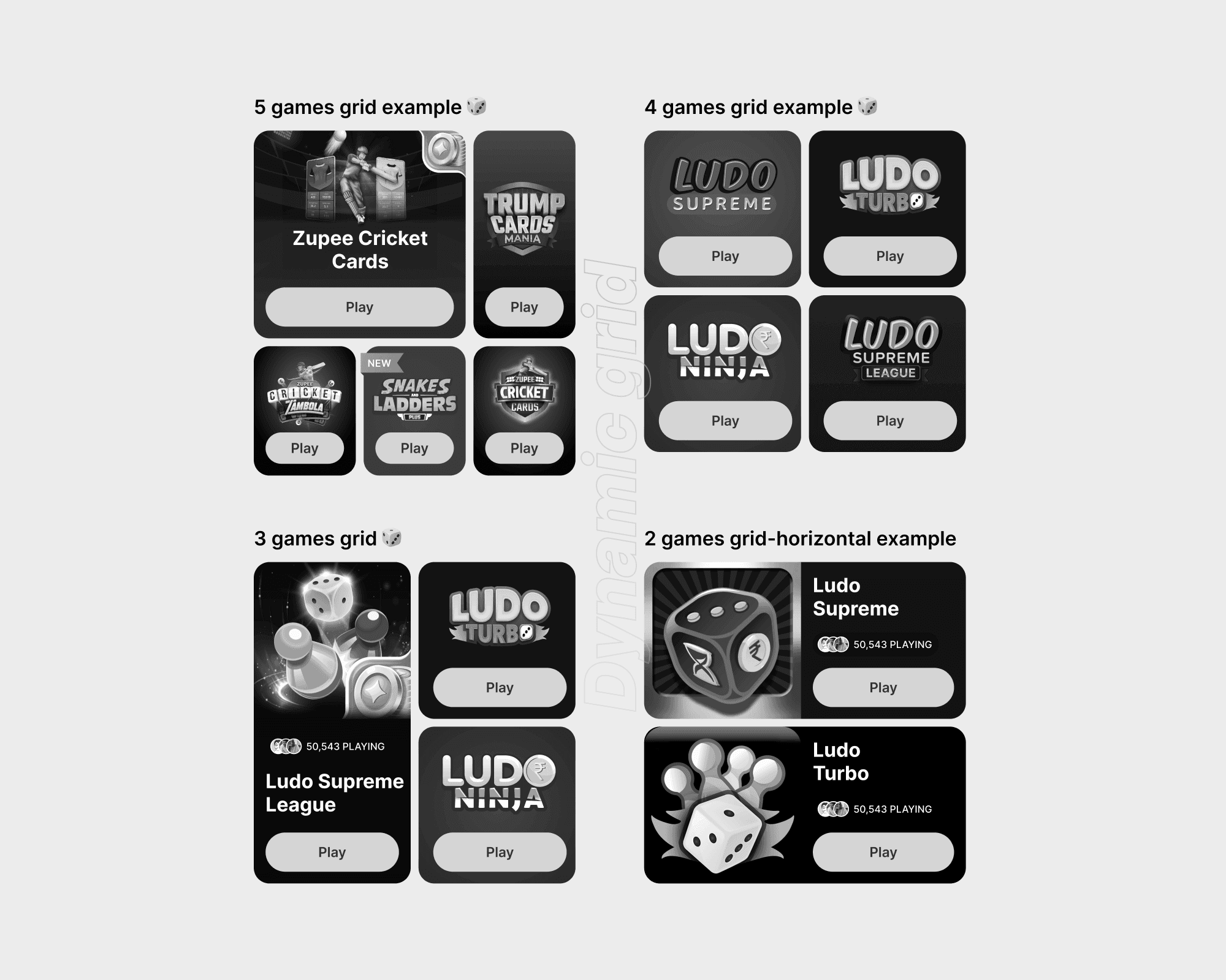
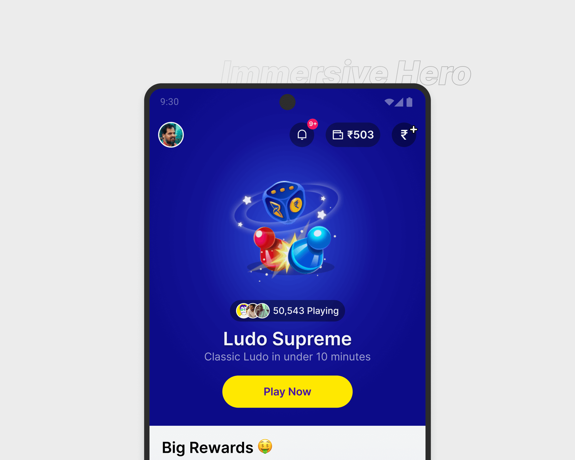
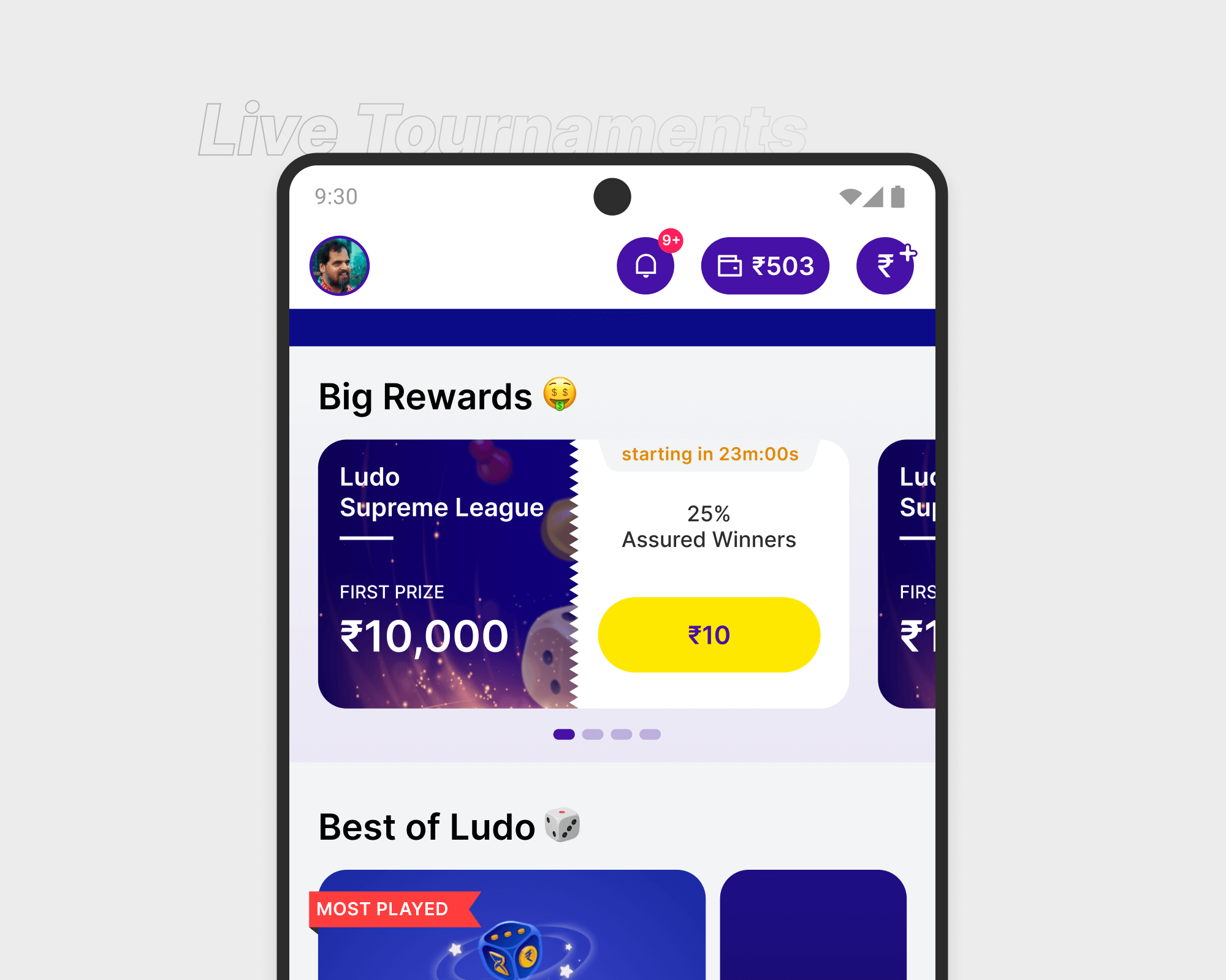
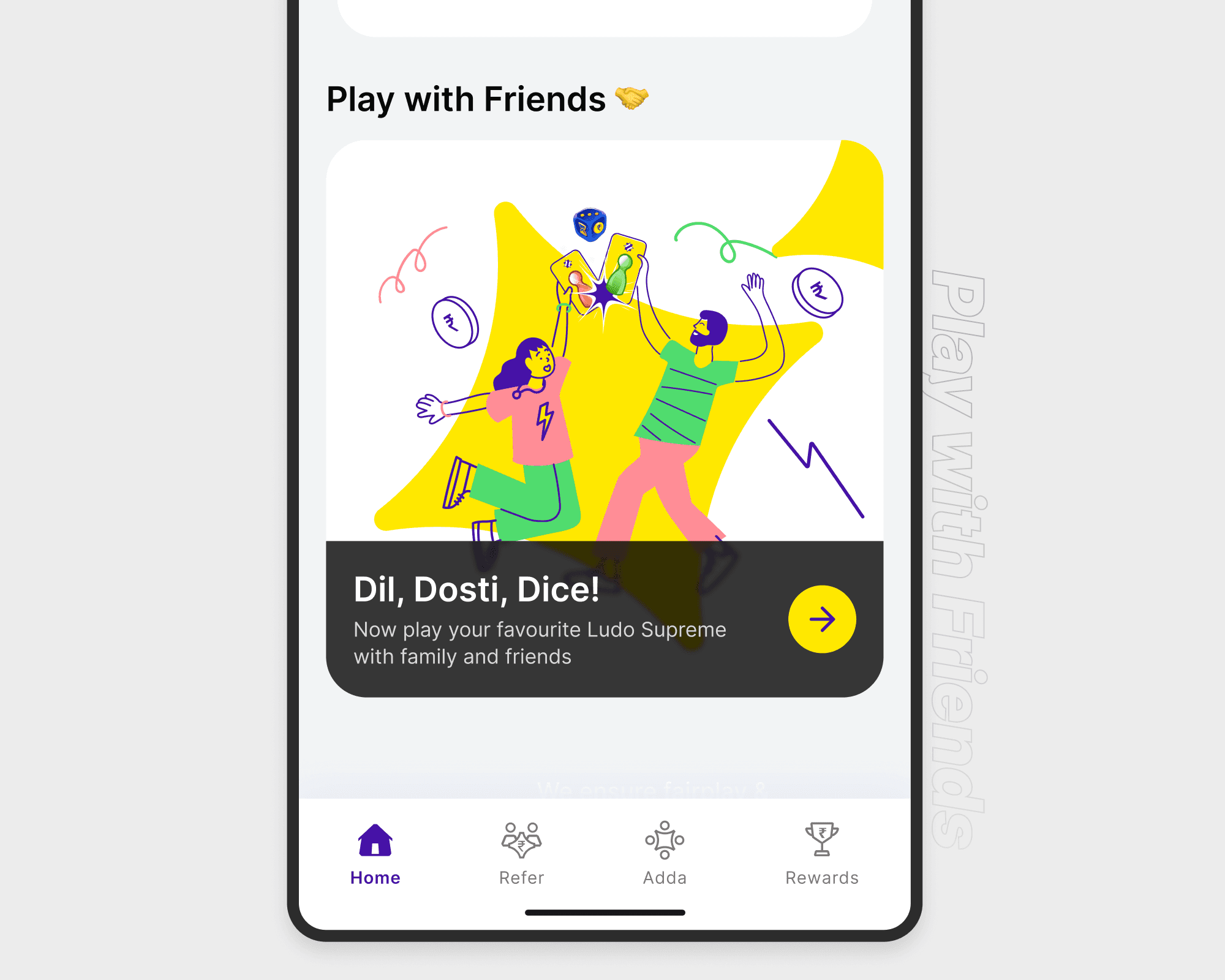
The design process began with rapid sketching of layout ideas that emphasized hierarchy and trust. These were refined into mid-fidelity wireframes and interactive prototypes, which we tested internally for quick feedback loops. A modular card-based layout replaced the flat list, offering a more dynamic and scannable interface. The hero section was redesigned to surface trending or new games with real-time player counts, while player verification tags and avatars addressed the trust issue. We also balanced content exposure and personalization—ensuring first-time users saw variety before being nudged toward repeat behavior.
Final Solution
The final design introduced a dynamic, scalable homepage that prioritized game discovery and trust. It featured top, new, and recently played games in separate sections, supported by real-time player indicators, verified tags, and clear call-to-action buttons. The modular structure allowed marketing and product teams to promote events and new content without developer intervention. The redesign improved both functional clarity and emotional trust, creating a more engaging and credible experience aligned with the brand’s goals.
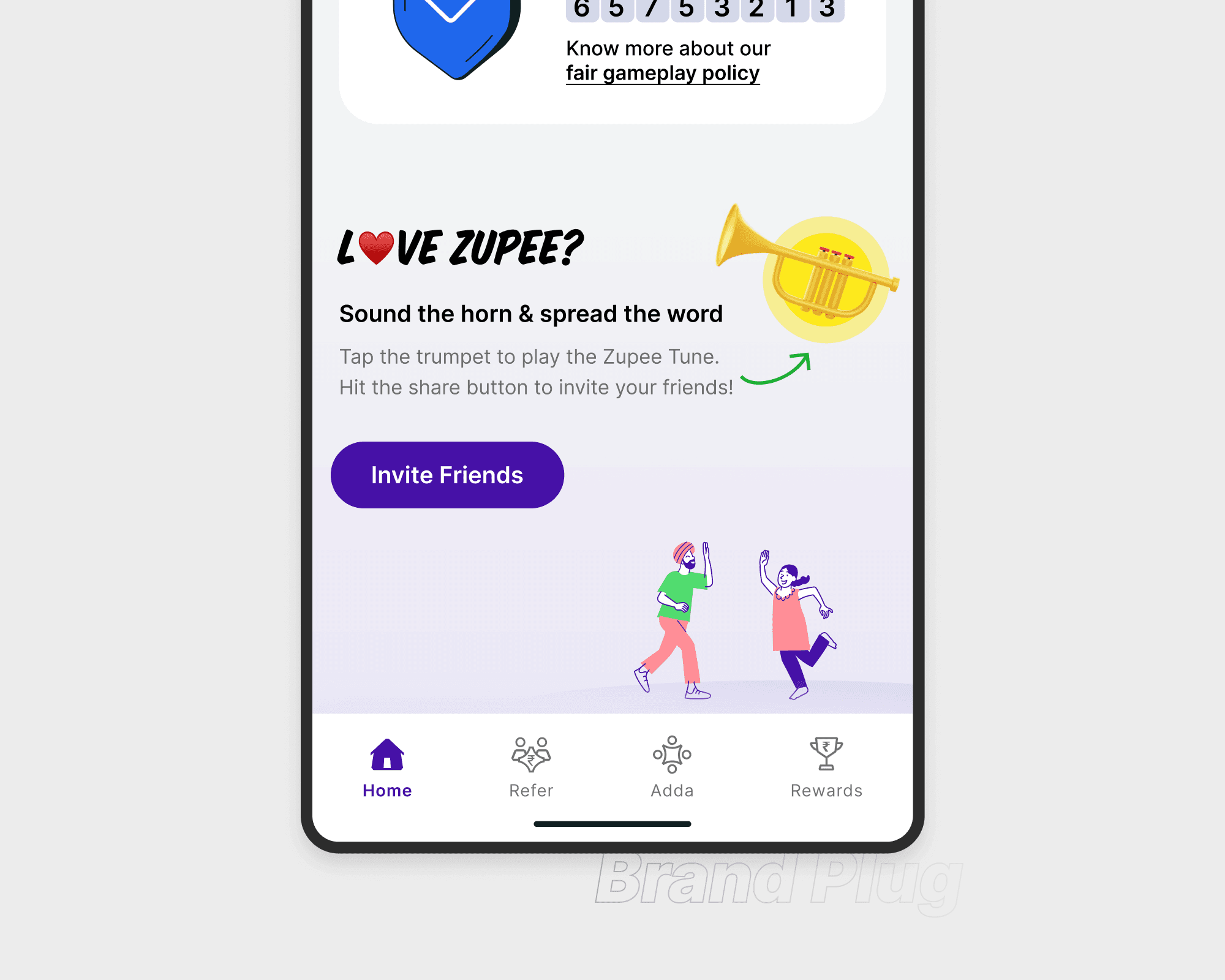
Prototype
Impact & Reflection
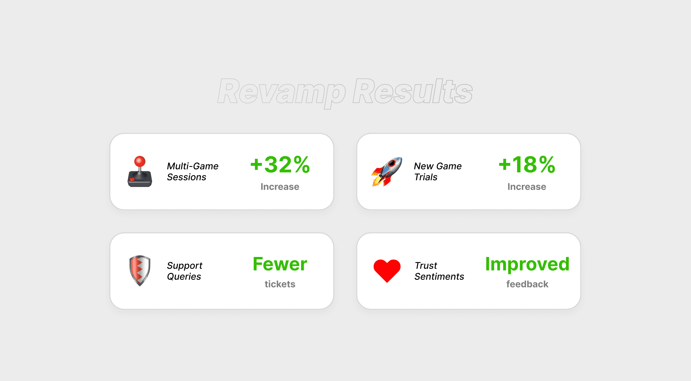
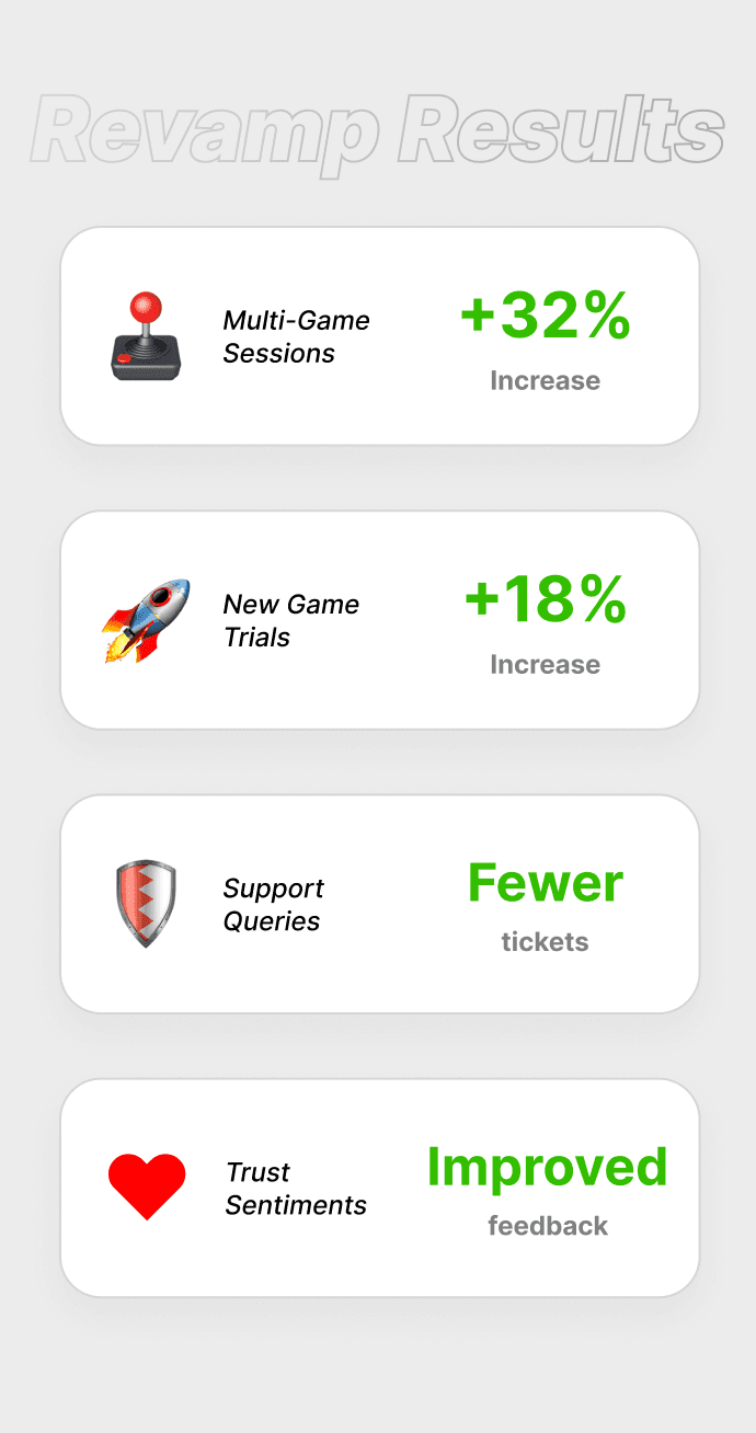
Post-launch metrics showed a 32% increase in multi-game sessions and an 18% lift in new game trials within two weeks. User sentiment around trust improved, with fewer support queries questioning opponent authenticity. Looking back, I’d push further on behavior-based personalization and explore game discovery as a gamified experience—rewarding users for trying something new. The project reinforced the value of solving user skepticism through thoughtful interaction design and scalable systems.
Testimonial
Now I see all my games right away. Feels more real and easier to choose.

Nakul Raj
Power User

